WooCommerce Product Page Mistakes: What Should You Avoid?
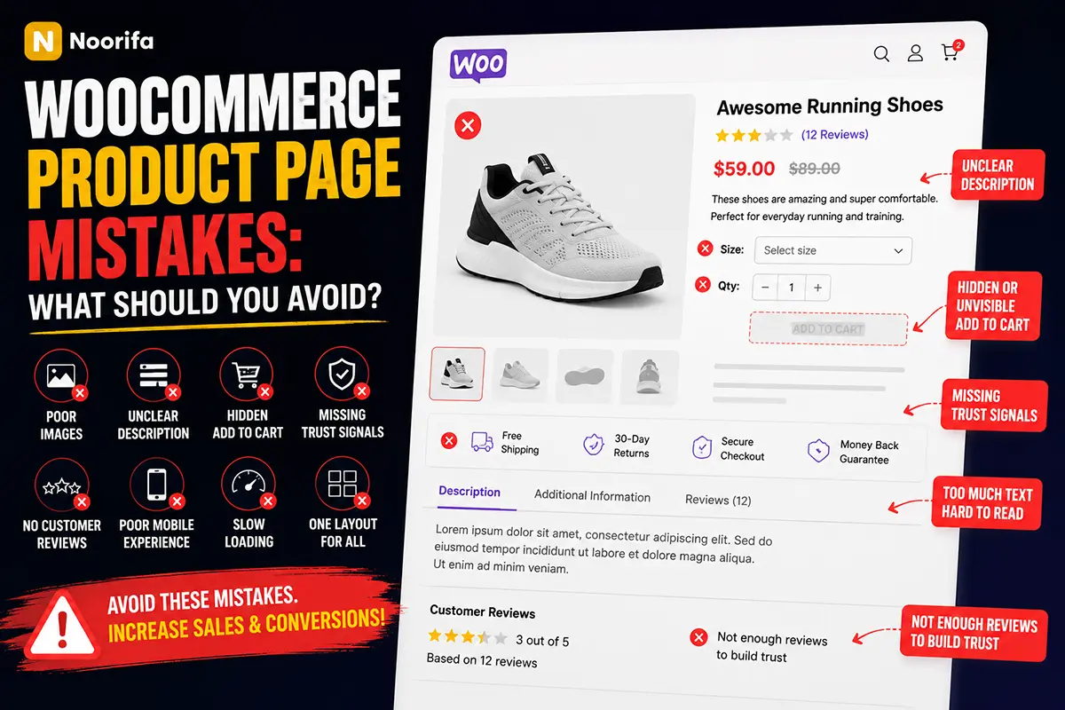
A WooCommerce product page can receive plenty of traffic and still fail to generate sales. In many cases, the problem isn’t the product. It’s how the product is presented. Below are some of the most common WooCommerce product page mistakes and how to avoid them.
What are the most common WooCommerce product page mistakes?
Some of the most common mistakes include:
- Poor product images
- Unclear product descriptions
- Hidden Add to Cart buttons
- Too much information at once
- Missing trust signals
- No customer reviews
- Poor mobile experience
- Slow page loading
- Using the same layout for every product
A good product page should make it easy for customers to understand, trust, and purchase the product.
Is using only one product image a mistake?
Usually, yes. Customers cannot physically inspect products when shopping online. A single image may not provide enough information. Consider showing:
- Different product angles
- Close-up details
- Product-in-use images
- Lifestyle images
- Size comparisons
Multiple high-quality images can help customers better understand what they are buying.
Should I avoid long product descriptions?
Long descriptions aren’t always bad, but large blocks of text can be difficult to scan. Instead, organize information using:
- Short paragraphs
- Bullet points
- Feature sections
- Icons
- Accordions
- Headings
Make important information easy to find.
Customers should never struggle to find the main purchase action. Make sure the Add to Cart button is:
- Clearly visible
- Easy to tap on mobile
- Close to the price and product options
- Visually easy to identify
For longer product pages, a sticky Add to Cart button can help keep the purchase option accessible.
Is too much information bad for conversions?
Too much information can overwhelm visitors, especially when everything is presented at the same level. The solution isn’t necessarily removing information. Instead, organize it properly. For example:
Above the fold:
Product → Benefits → Price → Add to Cart
Below the fold:
Details → Features → Reviews → FAQ
A clear information hierarchy helps customers focus on the most important content first.
Why are trust signals important?
Customers may hesitate before purchasing from a store they haven’t used before. Trust signals can reduce uncertainty. Examples include:
- Secure payment information
- Return policies
- Shipping information
- Money-back guarantees
- Customer reviews
- Certifications
Only display trust information that accurately represents your business.
Should every product page have customer reviews?
Reviews can provide valuable social proof. Customers often want to know whether other people were satisfied with:
- Product quality
- Performance
- Size
- Appearance
- Overall experience
Displaying genuine reviews can help answer these questions before a customer makes a purchase.
Is poor mobile design hurting product page conversions?
It can. Many ecommerce visitors browse and shop from mobile devices. Common mobile problems include:
- Small buttons
- Difficult product variation selectors
- Oversized text blocks
- Slow-loading images
- Important information hidden below unnecessary content
Always test your WooCommerce product page on an actual mobile device.
Should every WooCommerce product use the same layout?
Not always. Different products require different information. For example:
Skincare:
Benefits → Ingredients → How to Use → Reviews
Food:
Ingredients → Nutrition → Flavor → Serving Suggestions
Electronics:
Features → Specifications → Compatibility → Comparison
A flexible layout allows you to structure information based on customer needs.
Why should I test different product page layouts?
Design decisions are often based on assumptions. A/B testing allows you to compare different versions of a product page. You could test:
- Different layouts
- Product image placement
- Benefit sections
- Trust information
- CTA placement
With enough traffic, testing can provide useful data about how visitors interact with different versions.
How can I improve my WooCommerce product page?
Start by reviewing your page using this simple checklist:
✓ Are product images clear?
✓ Is the product value easy to understand?
✓ Is the Add to Cart button visible?
✓ Are important benefits easy to scan?
✓ Does the page include trust information?
✓ Are customer reviews available?
✓ Are common questions answered?
✓ Does the page work well on mobile?
Small improvements can create a better overall shopping experience.
How can Noorifa help improve WooCommerce product pages?
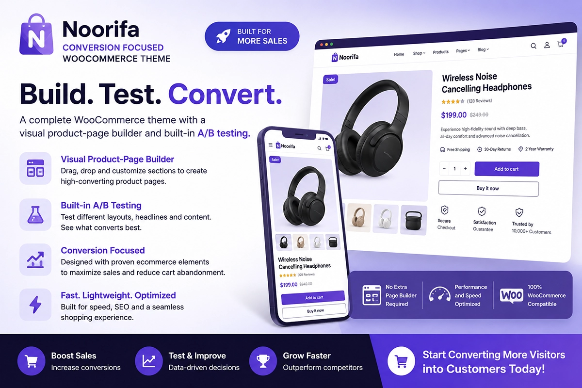
Noorifa is a conversion-focused WooCommerce theme designed to give store owners more control over product page layouts. You can build product pages using sections such as:
- Feature cards
- Custom product page
- Hero section
- Video testimonial
- Trust badges
- FAQ sections
- Comparison tables
- Reviews
- Product image sections
- Sticky Add to Cart
Noorifa also includes built-in A/B testing, allowing you to experiment with different product page layouts.
Final Thoughts
A high-converting WooCommerce product page doesn’t need to be complicated. Avoid common mistakes, organize information clearly, make purchasing easy, and focus on answering the questions customers have before buying. Most importantly, continue testing and improving your product page based on real customer behavior.
Build. Test. Convert.
Leave a Comment