WooCommerce Product Page Best Practices: 15 Ways to Increase Conversions
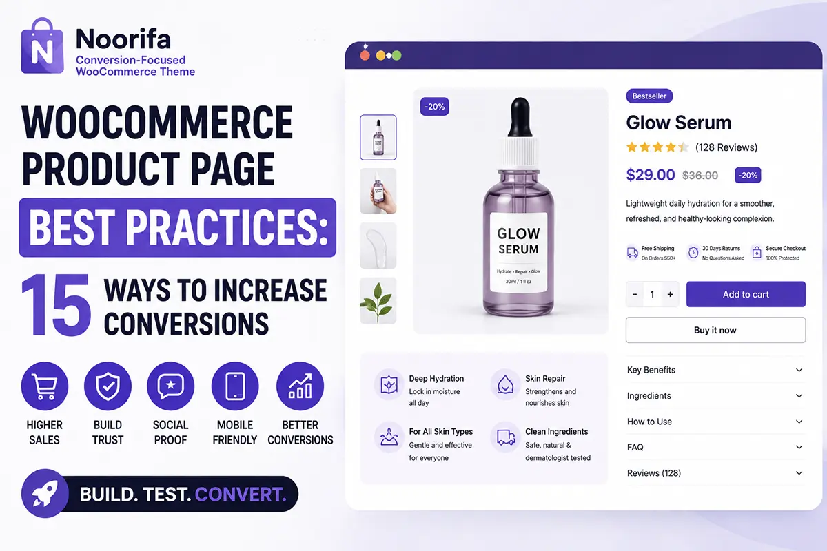
Your WooCommerce product page is one of the most important pages in your online store.
You can drive thousands of visitors to your website through SEO, paid ads, social media, or email marketing—but if your product page doesn’t clearly communicate the value of your product and make purchasing easy, many of those visitors may leave without buying.
A high-converting WooCommerce product page isn’t about adding more sections or making everything look flashy. It’s about helping customers answer important questions quickly:
- What is this product?
- Why should I buy it?
- Is it right for me?
- Can I trust this store?
- How much does it cost?
- How do I buy it?
In this guide, we’ll cover 15 WooCommerce product page best practices that can help you create a better shopping experience and potentially increase conversions.
1. Use High-Quality Product Images
Your customers can’t physically touch or inspect your product. Your images need to do some of that work.
Use multiple high-quality images that show:
- Different product angles
- Important details
- Product size or scale
- Packaging
- Texture, where relevant
- The product being used
For products such as skincare, cosmetics, fashion, or food, lifestyle and close-up images can also help customers better understand what they’re buying. Your main product image should immediately make the product look clear and appealing.
2. Write a Clear and Descriptive Product Title
Your product title should help visitors understand exactly what they’re looking at. Avoid vague names when possible. Instead of: Glow Serum You might use: Hydrating Glow Serum for Dry & Dull-Looking Skin
A descriptive title can communicate the product type and its primary purpose immediately. Keep it readable. You don’t need to stuff every keyword into the title.
3. Communicate the Main Benefit Quickly
Customers often want to know: What’s in it for me?
Don’t force them to read a long product description before they understand the value. Place a short value proposition near the top of the product page.
For example: Lightweight daily hydration for smoother, refreshed-looking skin.
Then support that statement with clear product information further down the page. A strong product page usually makes the product’s main benefit easy to scan.
4. Make Your Add to Cart Button Easy to Find
The purchase action should never be difficult to locate. Use a clear primary CTA such as: Add to Cart
Make sure it has enough visual contrast and isn’t surrounded by too many competing buttons. For products with options, also make it easy to select:
- Size
- Color
- Shade
- Quantity
- Other variations
Once the customer has made their selection, the path to adding the product to the cart should be simple and obvious.
5. Display Price Information Clearly
Price is an important part of the buying decision. Display the current price prominently near the purchase area. If you’re running a sale, clearly communicate:
- Original price
- Sale price
- Any legitimate discount information
Avoid making customers work to understand what they’ll pay. Clear pricing creates a simpler buying experience.
6. Add Ratings and Customer Reviews
Social proof can help customers feel more confident about a purchase. Display your product rating near the top of the page when reviews are available. Then provide a dedicated review section further down. Useful review content may include:
- Star ratings
- Written reviews
- Customer photos
- Verified purchase indicators, where applicable
- Product-specific feedback
Reviews can also answer questions that your product description doesn’t cover.
7. Use Trust Signals Near the Purchase Area
A customer may like the product but still hesitate to enter payment details or complete the purchase. Relevant trust signals can help reduce uncertainty. Depending on what your business genuinely offers, you might show:
- Secure checkout
- Shipping information
- Return policy
- Customer support
- Payment options
- Product guarantees
For example: Secure Checkout, Fast Shipping, Easy Returns
Only use trust claims that accurately represent your business.
8. Make Product Benefits Easy to Scan
Long paragraphs are difficult to scan—especially on mobile. Instead of putting every benefit inside a large description, consider using:
- Feature cards
- Icon lists
- Short bullet points
- Visual sections
For example:
Why You’ll Love It:
✓ Lightweight formula
✓ Easy to use daily
✓ Smooth, comfortable finish
✓ Designed for your intended use case
The goal is to help customers understand important information quickly.
9. Provide Complete Product Information
Benefits help sell the product, but customers also need details. Depending on your product, this might include:
- Ingredients
- Materials
- Dimensions
- Weight
- Compatibility
- Specifications
- What’s included
- Care instructions
You can organize this information using tabs, accordions, or clearly separated sections. Make important information accessible without overwhelming the top of the page.
10. Answer Questions With an FAQ Section
Every unanswered question can become a reason for a customer to delay or abandon a purchase. Think about the questions your customers commonly ask before buying. For example:
When will my order arrive? Explain your actual shipping policy.
What happens if I need to return it? Link to or summarize your return policy.
How do I use this product? Provide clear usage instructions.
Is it compatible with my device? Explain compatibility accurately.
A well-organized FAQ can reduce uncertainty and improve the shopping experience.
11. Optimize Your Product Page for Mobile
Many ecommerce visitors browse and shop from their phones. Your WooCommerce product page should work comfortably on smaller screens.
Check:
- Is the text easy to read?
- Are buttons large enough to tap?
- Are variation options easy to select?
- Do images load and display properly?
- Is the Add to Cart action easy to find?
- Are sections easy to scan?
Don’t simply assume a desktop layout will automatically create a good mobile experience. Always review the actual product page on a mobile device.
12. Use a Sticky Add to Cart Bar
On longer product pages, visitors may scroll through benefits, reviews, specifications, and FAQs before deciding to buy. When they’re ready, they shouldn’t always have to scroll all the way back to the main purchase area. A Sticky Add to Cart bar can keep key purchase information accessible as the visitor scrolls. Depending on the design, it can display:
- Product image
- Product name
- Price
- Selected variation
- Add to Cart button
Keep the design simple and avoid covering important content.
13. Create a Clear Product Page Structure
A good product page should tell a logical story. One possible structure is:
Product Gallery
↓
Product Title + Main Benefit
↓
Rating + Reviews
↓
Price
↓
Product Options
↓
Add to Cart
↓
Trust Signals
↓
Key Benefits
↓
Product Details / Specifications
↓
How to Use
↓
Customer Reviews
↓
FAQ
↓
Related Products
This order isn’t mandatory for every store or product. The best structure depends on your product and customers. However, organizing information around the customer’s buying journey can make the page easier to understand.
14. Reduce Distractions Around the Purchase Decision
More content doesn’t automatically mean a better product page. Too many:
- Popups
- Animations
- Banners
- Buttons
- Unrelated links
- Competing CTAs
can distract customers. Your primary goal on a product page should be clear: help the visitor understand the product and make it easy to purchase. Use visual hierarchy to guide attention toward important information. Whitespace can also make a page easier to read and feel less overwhelming.
15. Test Different Product Page Layouts
One of the most important product page best practices is not assuming that your first design is perfect. A layout that works well for one audience may not work the same way for another. You can test different elements, such as:
- Product page layouts
- CTA placement
- Benefit section position
- Review placement
- Image presentation
- Content order
For example:
Layout A — Product → Benefits → Add to Cart → Reviews
Layout B — Product → Reviews → Benefits → Add to Cart
Instead of deciding based only on which layout looks better, test where appropriate and use actual store data to inform future improvements.
Build a Better WooCommerce Product Page
The best WooCommerce product pages make it easier for customers to move from:
“What is this?”
to:
“This is right for me.”
to:
“I’m ready to buy.”
Focus on clear product information, strong visual presentation, relevant trust signals, an easy purchase process, and a mobile-friendly experience.
You don’t need to add every possible conversion element to every page. Start with the information your customers genuinely need, then improve and test your product page over time.
Customize Your WooCommerce Product Page with Noorifa
Creating a custom WooCommerce product page traditionally may require editing theme templates, writing custom code, or combining multiple plugins.
Noorifa is a conversion-focused WooCommerce theme designed to give you more control over your product page. With its visual product layout tools, you can create and customize product-page experiences using conversion-focused sections such as:
- Product layouts
- Custom product page
- Feature sections
- Trust badges
- FAQs
- Product reviews
- Comparison tables
- Sticky Add to Cart
- Related products
Noorifa also includes built-in A/B testing, allowing you to compare different product-page layouts rather than relying entirely on guesswork.
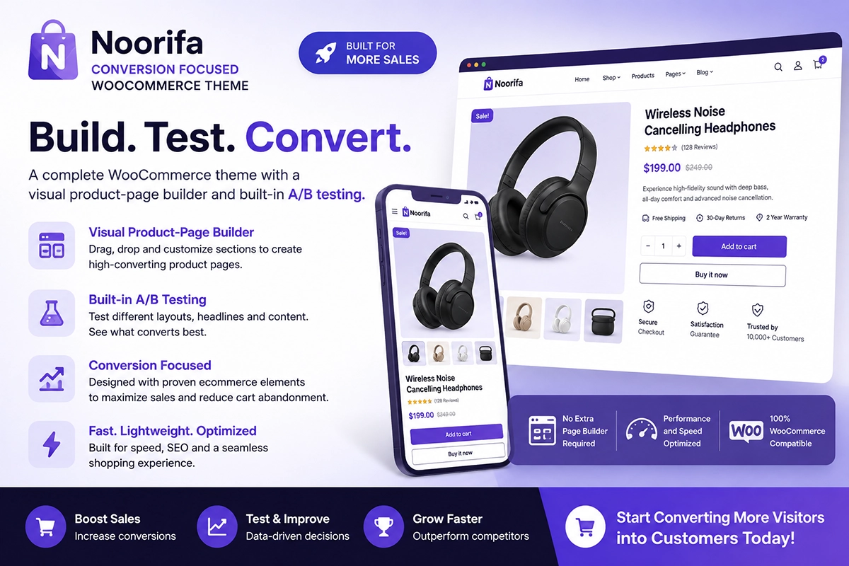
Build. Test. Convert.
Ready to create a better WooCommerce product page?
Leave a Comment