WooCommerce Add to Cart Button Optimization: How to Get More Clicks
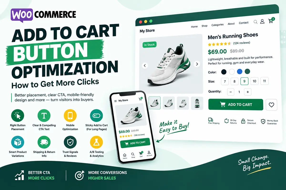
our Add to Cart button is one of the most important elements on a WooCommerce product page. A customer can love your product, read the description, and trust your store—but if the purchase action isn’t clear or easy to use, you may lose the sale. In this guide, we’ll look at how to optimize the WooCommerce Add to Cart button and create a smoother buying experience.
Why is the Add to Cart button important?
The Add to Cart button is the primary action that moves a customer from browsing to buying. A good product page should make this action:
- Easy to find
- Easy to understand
- Easy to use
- Clearly connected to the product and price
Don’t make customers search for the button after deciding they want to purchase.
Where should the Add to Cart button be placed?
The Add to Cart button should generally appear close to the key purchasing information.
A common structure is: Product Title → Rating → Price → Benefits → Variations → Quantity → Add to Cart
This puts the purchase action exactly where customers expect it. For long product pages, a sticky Add to Cart button can also keep the purchase action accessible while customers scroll.
What should a WooCommerce Add to Cart button say?
For most products, “Add to Cart” is clear and familiar. Depending on your store, alternatives could include:
- Buy Now
- Shop Now
- Get Yours
- Add to Bag
- Order Now
The important thing is clarity. Avoid creative CTA text if customers might not immediately understand what clicking the button will do.
Should I use “Buy Now” or “Add to Cart”?
It depends on your purchasing flow. Add to Cart works well when customers may want to purchase multiple products. Buy Now can work well when you want to take the customer directly toward checkout. For some stores, offering both options can be useful:
Add to Cart → Continue shopping
Buy Now → Proceed toward checkout
Test the experience to see what works best for your customers.
Should the Add to Cart button stand out?
Yes, but it shouldn’t look disconnected from your website. The button should have enough visual contrast from the surrounding content so customers can identify it quickly. Also consider:
- Button size
- Spacing
- Typography
- Hover state
- Mobile tap area
The goal isn’t to make the button huge. It’s to make the purchase action obvious.
How important is the Add to Cart button on mobile?
Very important. On mobile devices, customers have less screen space and interact using touch. Make sure the button:
- Is large enough to tap comfortably
- Doesn’t sit too close to other controls
- Is visible without unnecessary scrolling
- Works correctly after selecting variations
A sticky mobile Add to Cart bar can be particularly useful for long product pages.
Should I use a sticky Add to Cart button?
A sticky Add to Cart button can be helpful when product pages contain a lot of content. For example, a customer might scroll through:
Product Benefits → Specifications → Reviews → FAQ
A sticky purchase bar allows them to take action without scrolling back to the main product section. However, make sure the sticky element doesn’t cover important content or create a poor mobile experience.
What should appear around the Add to Cart button?
The area around the CTA should help customers make their purchase decision. Useful information can include:
- Price
- Selected variation
- Key benefit
- Shipping information
- Delivery estimate
- Return information
- Payment options
- Trust signals
Avoid placing too many competing messages around the button.
Should I show shipping information near the CTA?
If shipping is an important purchase consideration, yes. For example: Free shipping on orders over $50 or Estimated delivery: 2–4 business days. Clear shipping information can help reduce uncertainty at the moment when the customer is deciding whether to purchase. Only display accurate information based on your actual store policies.
How can I improve the Add to Cart experience for product variations?
Variable products need special attention. Customers should be able to easily select options such as:
- Size
- Color
- Material
- Quantity
- Flavor
After selecting a variation, the price, availability, image, and purchase controls should update correctly. A confusing variation selector can create unnecessary friction and prevent customers from completing the purchase.
Should I test different Add to Cart buttons?
Yes, if your store has enough traffic to make testing meaningful. You could test:
- Button text
- Button placement
- Sticky vs. non-sticky CTA
- Supporting information
- Different product-page layouts
- Add to Cart vs. Buy Now
Instead of assuming which design is best, use real customer behavior to guide your decisions.
Can a better Add to Cart button increase WooCommerce conversions?
It can help, but there is no universal button design that guarantees higher conversions. Your CTA is only one part of the product page.
Customers also need: Good product → Clear value → Trust → Useful information → Easy purchase
If the product page doesn’t communicate value or answer customer concerns, changing the button alone won’t solve the problem.
How can Noorifa help customize the Add to Cart experience?
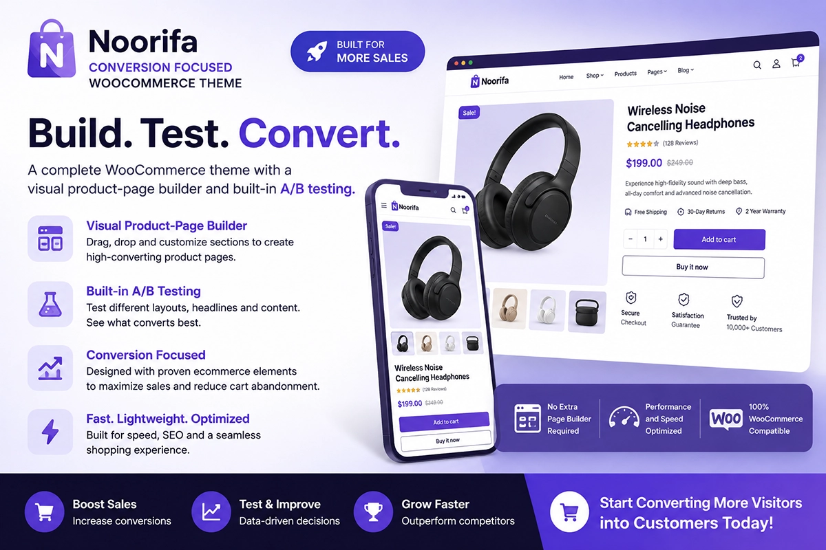
Noorifa is a conversion-focused WooCommerce theme designed to give store owners more control over their product pages. You can build custom product layouts and organize elements such as:
- Product information
- Custom product page
- Hero section
- Built in A/B testing with result
- Benefits
- Product variations
- Trust badges
- Shipping information
- Reviews
- FAQs
- Sticky Add to Cart
- 30+ Custom blocks
Noorifa also includes built-in A/B testing, allowing you to experiment with different product-page layouts and measure how they perform.
Final Thoughts
The Add to Cart button may be a small element, but it plays a major role in the ecommerce buying journey. Make it easy to find, easy to understand, and easy to use—especially on mobile. Then look beyond the button itself. The surrounding product information should give customers enough confidence to take action.
Don’t make customers think about how to buy. Make buying the easiest thing on the page.
Leave a Comment