How to Create a High-Converting Custom Cosmetic Product Page in WooCommerce
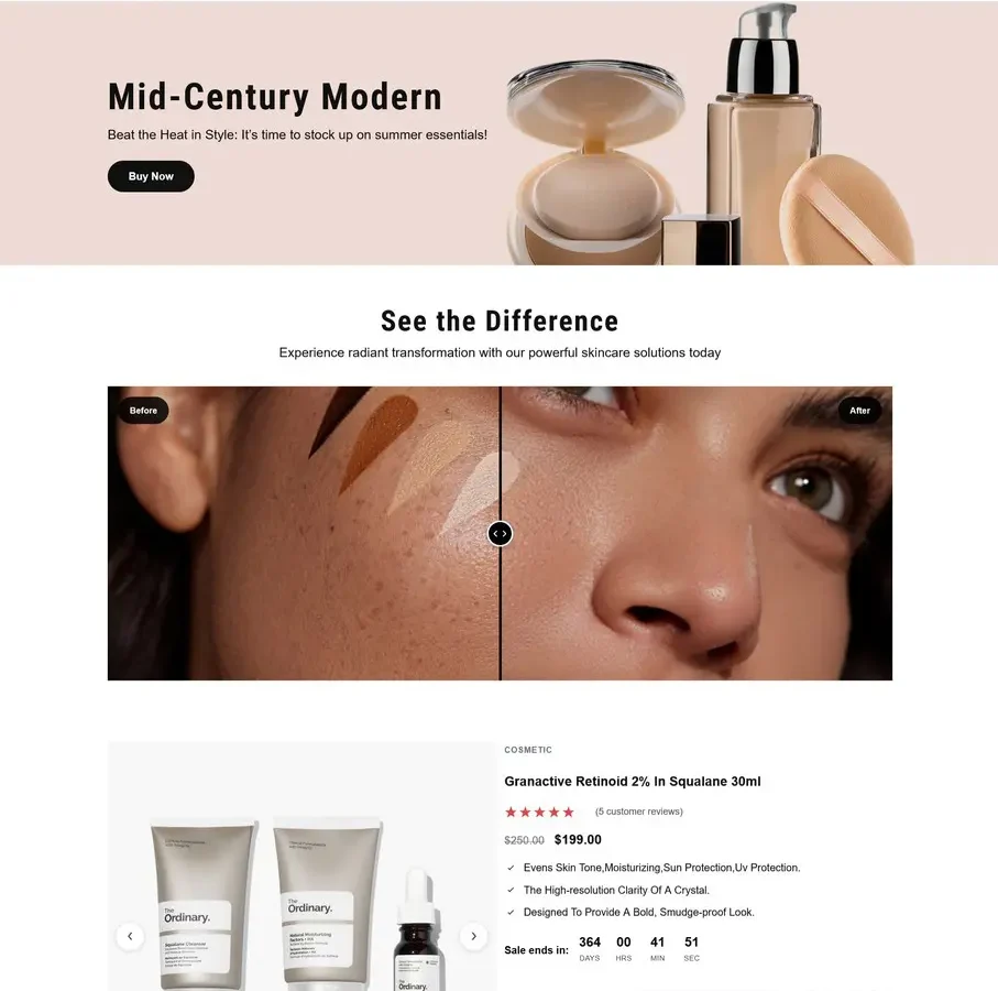
Learn how to create a high-converting custom cosmetic product page in WooCommerce with better design, product benefits, ingredients, reviews, trust signals, and clear CTAs.
Selling cosmetics online is not just about putting a product image, price, and Add to Cart button on a WooCommerce page.
Customers want to know what the product does, what’s inside it, how to use it, whether it’s right for them, and whether they can trust the brand.
That’s why a custom cosmetic product page can make a significant difference.
A well-designed product page can present your product more effectively, answer customer questions, build trust, and create a smoother path from product discovery to purchase.
In this guide, we’ll look at how to create a high-converting cosmetic product page in WooCommerce.
1. Start With a Strong Product Hero Section
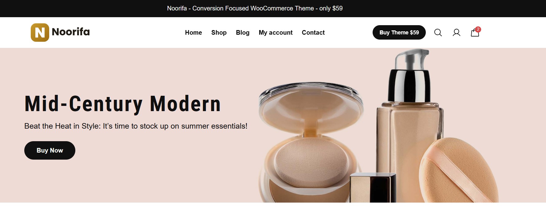
The first section of your cosmetic product page is extremely important.
When someone lands on the page, they should immediately understand:
- What the product is
- What it does
- Who it’s for
- Why they should consider it
- What action they can take next
Instead of displaying only a product title and price, create a more focused hero section.
For example:
Hydrating Glow Serum
Lightweight daily hydration for a smoother-looking, refreshed complexion.
★★★★★ 4.8/5 from 250+ reviews
$29.00
[Add to Cart]
You can also include small trust elements such as:
- Secure checkout
- Fast shipping
- Easy returns
- Cruelty-free, if applicable
- Dermatologically tested, if applicable
The goal isn’t to fill the screen with information.
The goal is to make the value of the product immediately clear.
2. Use High-Quality Cosmetic Product Photography
Cosmetics are highly visual products.
Your product photography should therefore be one of the strongest elements of your WooCommerce product page.
Consider using:
Product Images
Show the product from multiple angles.
Lifestyle Photography
Show the product in an environment that matches your brand.
Texture Photography
For creams, serums, foundations, and other products, showing texture can help customers understand the product better.
Packaging Details
Close-up images can communicate the quality of your packaging and branding.
A custom WooCommerce product page gives you more control over how these images are presented instead of relying on a generic gallery layout.
3. Show Benefits Before Going Into Technical Details
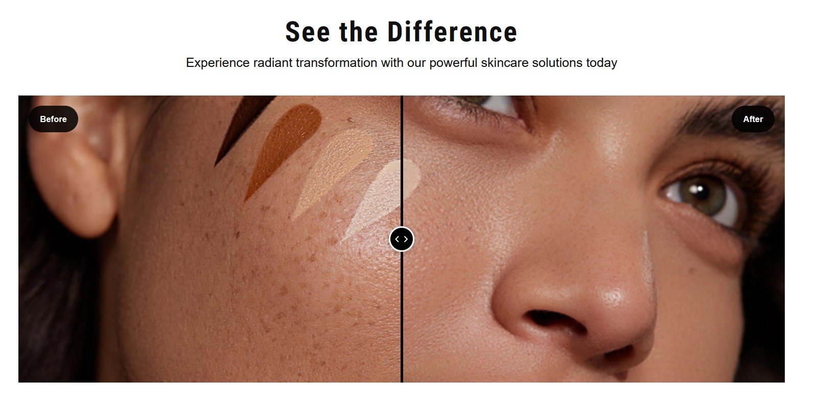
Customers don’t necessarily want to read a long product description immediately.
They want to understand:
“What’s in it for me?”
Create a short benefits section that is easy to scan.
For example:
Why You’ll Love It
✓ Lightweight hydration
✓ Helps skin feel smoother
✓ Non-greasy finish
✓ Easy to use every day
✓ Suitable for your specified skin types
Keep the claims accurate and supported by your product information.
The purpose of this section is to help customers quickly understand the practical value of the product.
4. Create a Dedicated Ingredients Section
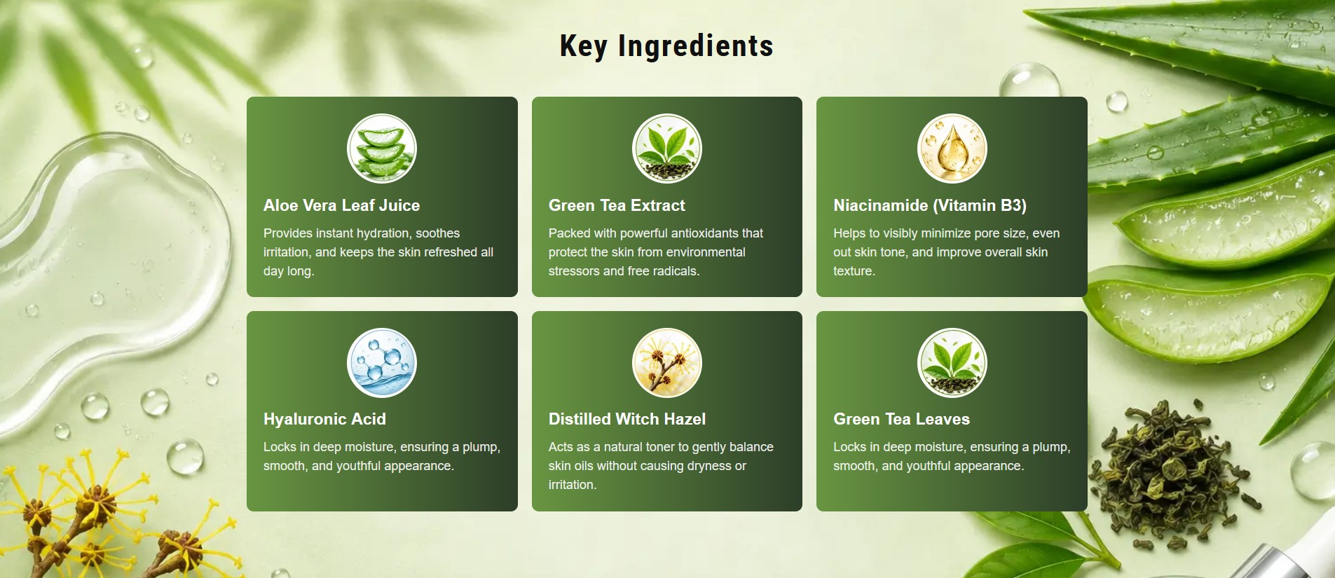
Ingredients can be one of the most important parts of a cosmetic product page.
Instead of hiding the ingredients inside a long paragraph, create a dedicated visual section.
For example:
Key Ingredients
Aloe Vera
Provides hydration and helps soothe the skin.
Green Tea Extract
Contains antioxidants and supports a refreshed skin feel.
Niacinamide
A popular skincare ingredient used in formulations targeting the appearance of uneven tone and texture.
Hyaluronic Acid
Helps attract and retain moisture.
You can use ingredient icons, cards, or visual illustrations to make this section easier to scan.
This is especially useful for customers who are actively researching what’s inside a cosmetic product.
5. Explain How to Use the Product
Don’t make customers search through a long description to find instructions.
Create a simple How to Use section.
For example:
How to Use
01 — Cleanse
Start with clean, dry skin.
02 — Apply
Apply a small amount of product as directed.
03 — Massage
Gently distribute the product according to the product instructions.
04 — Follow Your Routine
Continue with the remaining steps of your skincare routine.
A visual step-by-step section can make the page feel much more professional.
6. Add Social Proof
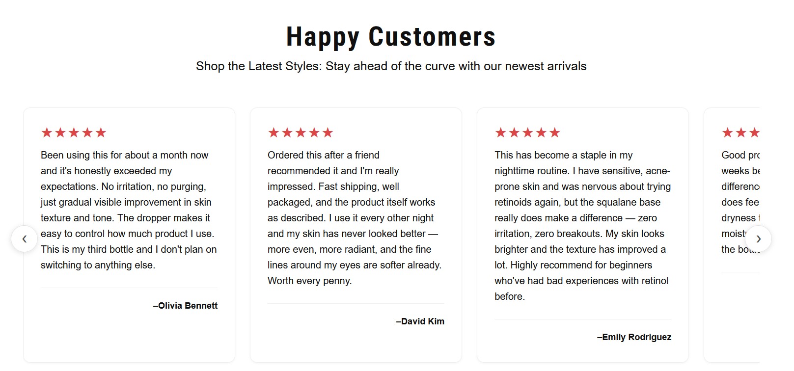
Customers are more comfortable buying when they can see evidence that other people have purchased and enjoyed the product.
Your cosmetic product page can include:
- Star ratings
- Customer reviews
- Review photos
- Video testimonials
- Before-and-after content where appropriate and compliant
- Number of verified purchases
- User-generated content
For example:
⭐⭐⭐⭐⭐
“The texture is lightweight and feels great on my skin.”
A dedicated review section can turn customer feedback into an important part of the buying journey.
7. Use Trust Signals Near the Purchase Area
A customer might like your product but still hesitate before clicking Add to Cart.
Trust signals can help reduce uncertainty.
You could display:
🔒 Secure Checkout
🚚 Fast Shipping
↩️ Easy Returns
💳 Secure Payment
💬 Customer Support
Only display claims and policies that your business actually provides.
Keep these elements visually simple so they support the purchase decision rather than distracting from it.
8. Add an FAQ Section
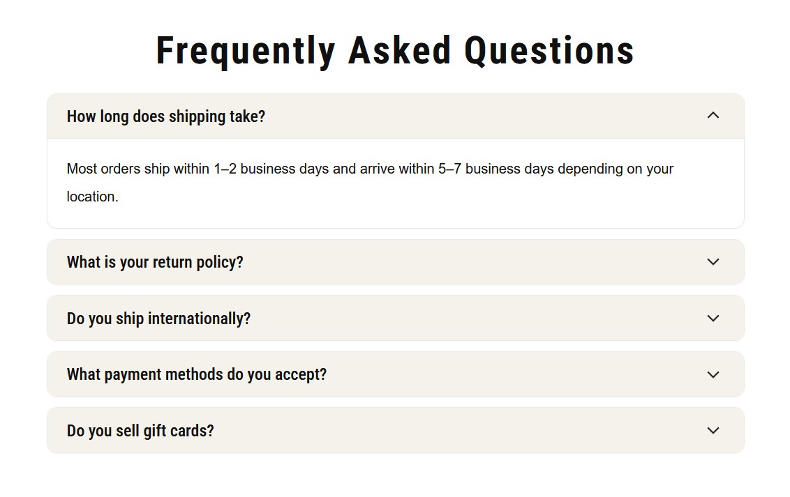
Cosmetic products often generate questions before purchase.
Instead of making customers contact your support team for every question, answer common questions directly on the product page.
9. Keep the Add-to-Cart Button Clear
A beautiful product page won’t help much if customers struggle to find the purchase action.
Your primary CTA should be visually obvious.
Instead of surrounding it with dozens of competing buttons, make the main action clear:
Add to Cart
For products with variations, make options such as:
- Size
- Color
- Shade
- Quantity
easy to select.
For mobile shoppers, consider a sticky Add to Cart bar that remains accessible as they scroll through the page.
10. Design the Page for Mobile First
A large percentage of ecommerce traffic can come from mobile devices.
Your cosmetic product page should therefore be designed for a small screen—not simply squeezed into one.
Pay attention to:
- Image size
- Font readability
- Button size
- Product variation selection
- Sticky CTA
- Page loading speed
- Section spacing
- Navigation
- Checkout experience
A page that looks beautiful on desktop but is difficult to use on mobile can create unnecessary friction.
11. Don’t Put Everything Above the Fold
One common mistake is trying to put every piece of information into the first screen.
You don’t need:
Product → Ingredients → Reviews → FAQ → Benefits → Testimonials → CTA
all at once.
Instead, create a logical customer journey:
Product → Value → Purchase → Benefits → Ingredients → Proof → FAQ → Purchase
Give each section enough breathing room.
A premium cosmetic website often feels premium because of clarity and hierarchy, not because it contains more elements.
12. Test Different Product Page Layouts
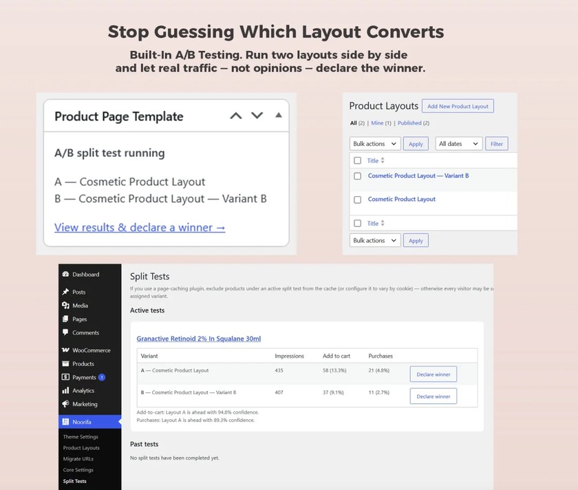
Here’s where conversion optimization becomes interesting.
You don’t have to assume that your first design is the best design.
You can test different versions of your product page.
For example:
Version A
Large product image
→ Product information
→ Add to Cart
→ Benefits
→ Ingredients
Version B
Product image
→ Strong value proposition
→ Reviews
→ Add to Cart
→ Benefits
→ Ingredients
Then compare how visitors interact with each version.
Instead of asking:
“Which design looks better?”
you can start asking:
“Which design performs better?”
How to Build a Custom Cosmetic Product Page in WooCommerce
Creating this type of product page with a traditional WooCommerce setup can involve editing theme templates, writing custom code, or installing multiple plugins.
That’s exactly the problem Noorifa is designed to solve.
Noorifa is a conversion-focused WooCommerce theme with a visual product-page builder and built-in A/B testing.
You can visually build product layouts using sections such as:
- Hero sections
- Product galleries
- Product information
- Feature cards
- Ingredient sections
- Comparison tables
- Trust badges
- Reviews
- FAQs
- Sticky Add to Cart
- Related products
- Custom CTA sections
Instead of creating the same page manually for every product, you can create a reusable product layout and apply it across your store.
Final Thoughts
A high-converting cosmetic product page isn’t simply a beautiful collection of images and colors.
It’s a carefully structured shopping experience.
Your product page should answer the customer’s questions, communicate the product’s value, establish trust, remove objections, and make purchasing easy.
With WooCommerce + a custom product-page layout, you can create a much more engaging experience than the standard WooCommerce product template.
And with Noorifa, you can build, customize, reuse, and test those product-page layouts visually—without relying on a separate page builder for everything.
Ready to build a better WooCommerce product page?
Build. Test. Convert.
Leave a Comment